SARA
ROLE
AI UI Design Engineer
UX strategy
Dashboard IA
Prototyping
SKILLS
TIMELINE
AI support and insights
Case study
5 min read
Jan-April 2025
SARA is an AI-powered chatbot aimed at businesses who want to collect leads and automate initial customer interactions. When I joined, analytics were fragmented, pricing was unclear, and prospects struggled to understand value, which made sales handoffs and trial conversions inconsistent. My goal was to design an analytics-first dashboard that lets product and growth teams answer “How is the bot performing?” at a glance, and to present pricing that’s transparent and builds trust.
Constraints & success metrics
Ideation: flows & IA
Overview
Roles & Responsibilites
UNDERSTANDING THE OPPORTUNITY
Remote internship, cross-timezone team with limited engineering capacity
Existing data model constrained some visualizations (sessions, tokens, response time)
Need for quick handoff and modular components for reuse
Success metrics
Increase website leads (conversion rate on contact / demo forms)
Reduce time-to-insight (time for product manager to determine trend)
Adoption of 3 newly-designed features in production
Led product design for SARA’s analytics and pricing.
Ran user interviews and usability tests (10+).
Designed data-first dashboard and responsive mobile analytics.
Created transparent pricing UI and compare flows.
Delivered engineering-ready components and design system tokens.
I redesigned SARA’s analytics dashboard, created a clear pricing experience, and shipped mobile-first analytics features to help product and CS teams make faster decisions. This work included research, prototyping, 10+ user interviews, and a full handoff to engineers.
01
Designing an analytics-first dashboard and transparent pricing to help sales and product teams scale AI chat experiences.
RESEARCH
I ran qualitative interviews and analytics reviews to identify the biggest gaps. Research focused on what the managers and customer success needed from SARA’s analytics.
I conducted
What was found from the research
5+ remote user interviews (product managers, CS, sales)
Competitive audit of analytics dashboards (Amplitude-style dashboards, vendor chat tools)
Event review to see where prospects dropped off on site and pricing pages
02
Users wanted a single-page “Health” view of bot performance (sessions, tokens, response time, daily chats).
Pricing copy was confusing, users couldn’t map features to value, which hurt demos.
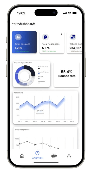
Mobile analytics were under-scoped; internal team often check metrics on mobile since it's easier.
Quick insights + contextual next steps were critical (e.g., “Tokens spiked- check model prompt”).
IDEATION & RESULT
I sketched multiple variations of a dashboard “health” view, prioritized top KPIs, and created an IA for dashboards, assistant management, and user data.
Final outcome
03
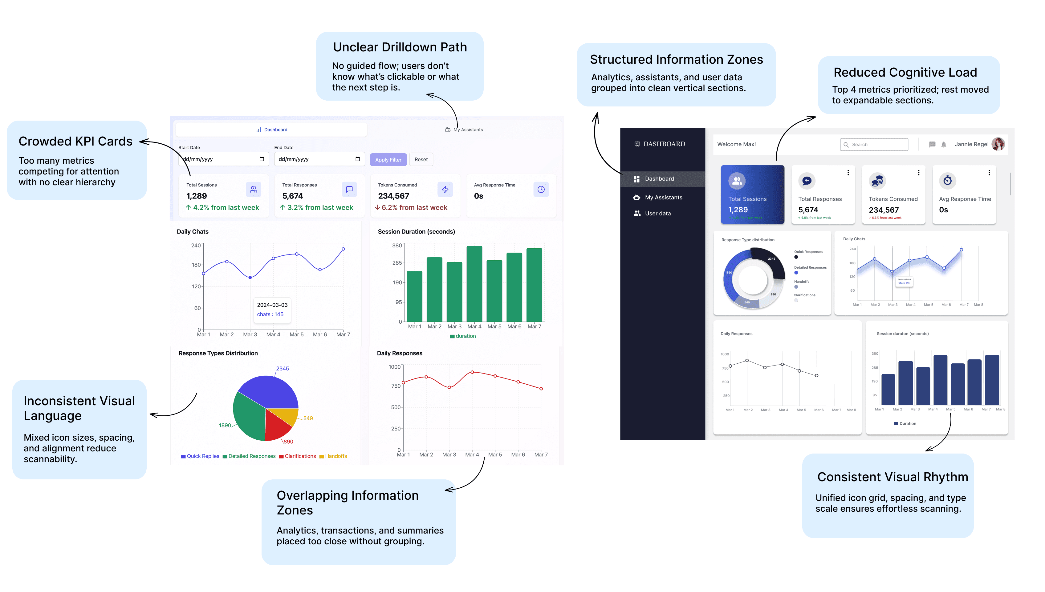
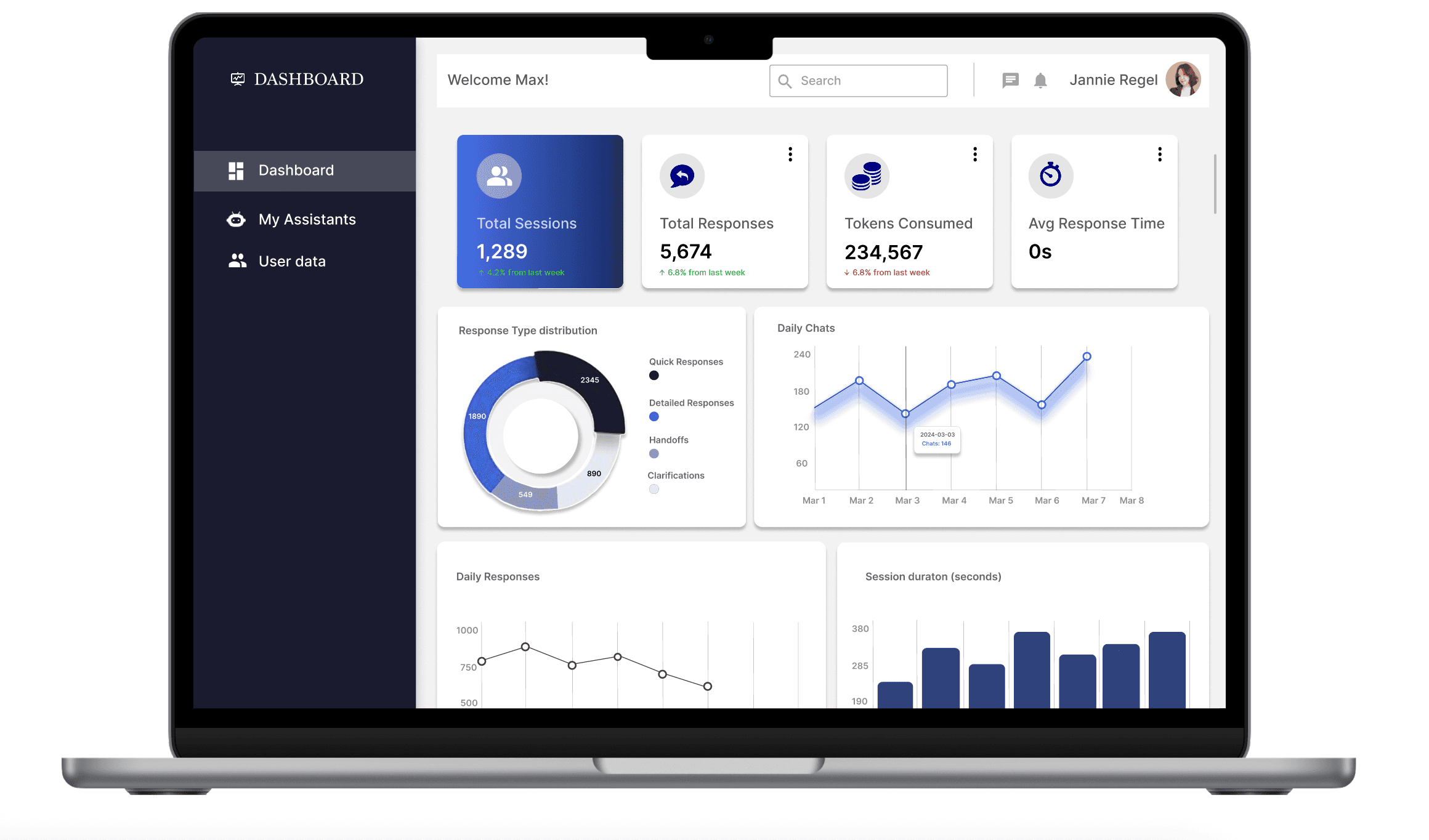
The original dashboard (on left) and the redesign (on right) highlighting the improvised segments and the reasons for the changes
I redesigned the dashboard to make KPIs obvious, charts easy to compare, and actions contextual, while maintaining a clean visual system for product analytics.
The KPI strip gives users an at-a-glance health check so they no longer need to scan multiple areas to understand performance.
The chart grid introduces predictable drilldowns (hover → tooltip → export), making analysis faster and more intuitive.
A task-focused left navigation helps users immediately locate core sections like assistants, dashboard, and data without hunting.
These updates create a clearer hierarchy, reduce time-to-insight, and bring consistency to interactions through unified card states, overflow menus, and microcopy. Soft shadows, rounded cards, and a focused navy accent improve visual rhythm and help primary KPIs stand out without overwhelming the viewer.
What this achieves
Pricing plans: design & copy
RESULT
Pricing was a major friction point in converting trial users. I created a transparent, visually-scannable pricing system with a freemium entry, a Pro plan, and an Enterprise tier with an obvious contact CTA.
1. Visually Distinct “Tier Architecture”
Instead of using repetitive rectangular cards, each plan uses a rounded arch silhouette.
This does two things:
Creates scannability — users can instantly differentiate Freemium, Pro, and Enterprise without reading.
Builds brand personality — the curved shape mirrors the soft, gradient visual language of the product, making the page feel crafted rather than template-driven.
2. Clear Value Laddering
The visual hierarchy is designed to guide the user toward the Pro plan without aggressive push tactics:
The Pro card is taller and visually centered.
The “Most popular” badge is placed where the eye naturally lands after scanning the pricing header.
The Enterprise plan intentionally shifts away from price and toward “Contact sales,” signalling a solution-based tier rather than a commodity one.
This reduces friction for self-serve users while giving enterprise buyers a natural path to sales.
3. Radical Transparency for Trust
A major insight from user interviews was that unclear taxes and hidden fees created drop-offs.
To fix this:
I surfaced “+18% GST” directly next to the amount, not in footnotes.
Feature lists map directly to core user jobs (e.g., speed, assistants, concurrent visitors).
Support SLAs are written in plain language.
The result: a pricing experience that feels honest, predictable, and confidence-building.
4. Interaction Design That Reduces Comparison Fatigue
Most pricing pages make the user scroll or parse dense comparison tables.
I took a different approach:
Clean, short checklists instead of technical jargon.
Consistent iconography for faster scanning.
Optional “Compare features” expansion for buyers who need more detail.
A planned monthly ↔ annual toggle with real-time recalculation to support financial flexibility.
The experience is lightweight by default and deep when needed — not overwhelming.
5. Visual System Aligned With the Product Experience
To maintain continuity across the ecosystem:
I used deep navy accents (aligned with the dashboard UI).
Soft gradients echo the AI-assistant brand positioning.
Rounded 2XL surfaces and smooth shadows match the overall identity.
This makes pricing feel like a coherent part of the product, not a marketing afterthought.
While most SaaS pricing pages follow a predictable, flat card layout with generic feature bullets, I designed this system to feel intentional, premium, and conversion-oriented, aligned with the product’s positioning.
Final outcome
04

The original dashboard (on left) and the redesign (on right) highlighting the improvised segments and the reasons for the changes
The outcome
IMPACT
Website leads increased by 25% after the website and pricing redesign (tracked via lead form conversions).
Three user-requested features were built within two months (Quick Export, Alert rules, Pricing modal) after testing and prioritization.
Internal feedback: PMs reported faster time-to-insight; CSMs began using mobile analytics for on-the-go checks.
06
What I learned
LEARNINGS
The project taught me how analytics design changes product decision-making — and how pricing clarity directly influences demo conversion. Next I'd iterate on explanation-first onboarding flows for admins and expand the alerting system to include Slack/email integrations.
07
Screens
05
©
Nitya Gaddala
2025