THE FINAL PROTOTYPE
Introducing SkillSwap
SKILLSWAP
ROLE
UX Designer
Product Designer
Interaction Designer
Prototyping
SKILLS
TIMELINE
A modern barter system but
for skills, not stuff
Case study
7 min read
Dec-Feb 2025

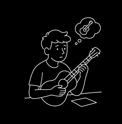
Most people start with genuine excitement the urge to finally pick up that one skill they’ve always dreamt of. But the moment they try to learn alone, the spark fades.
Tutorials are passive. They can’t correct posture, explain why something isn’t working, or adapt to how you learn. Frustration grows as doubts pile up with no one to answer them in the moment.
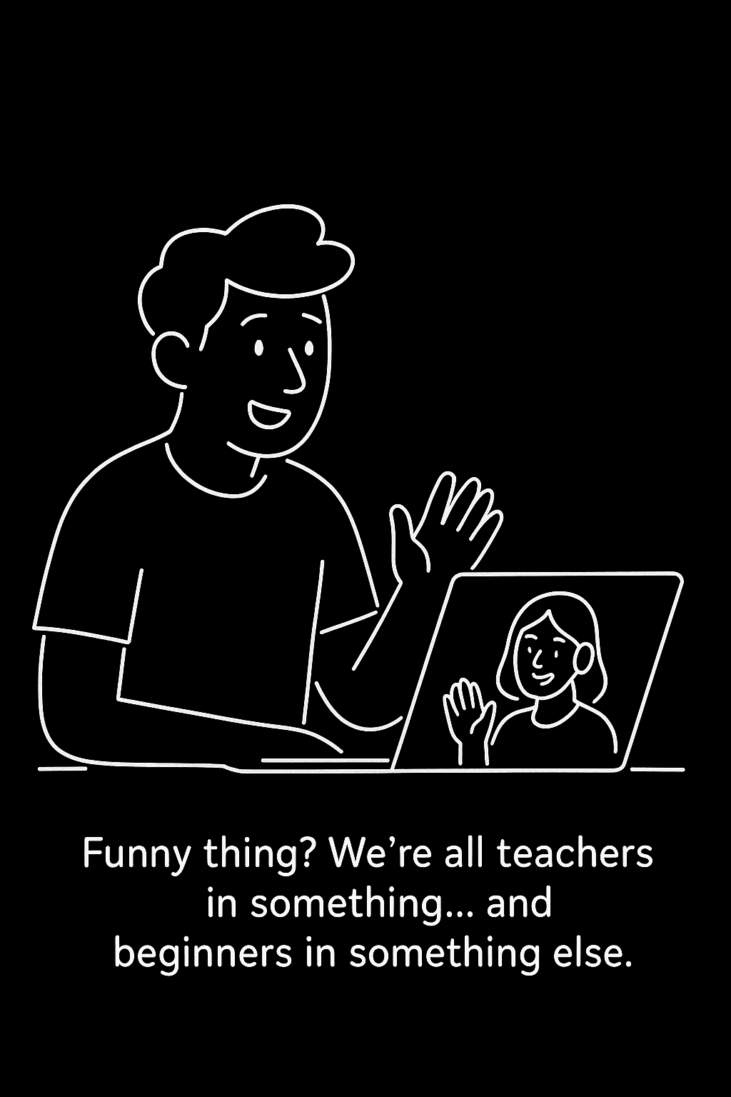
Everyone has a skill someone else needs. But without the right match, those connections never happen.
Learning grows through exchange, not isolation.
Self-Learning Isn’t Built for Real Questions
The Hidden Reciprocity in Learning
THE CHALLENGE
USER RESEARCH
How can we help learners find the right person to learn from without feeling
overwhelmed, stuck or unsure where to start?
Understanding the problem
From insight to intent
Despite the abundance of online learning platforms, people still struggle with discovering the right mentor,
knowing which skill path fits them, and staying motivated long enough to make real progress.
What I focused on solving:
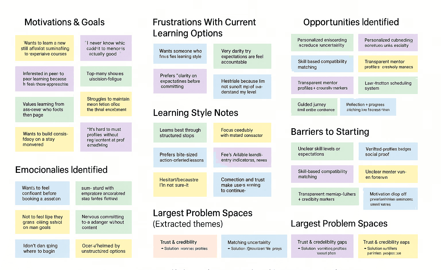
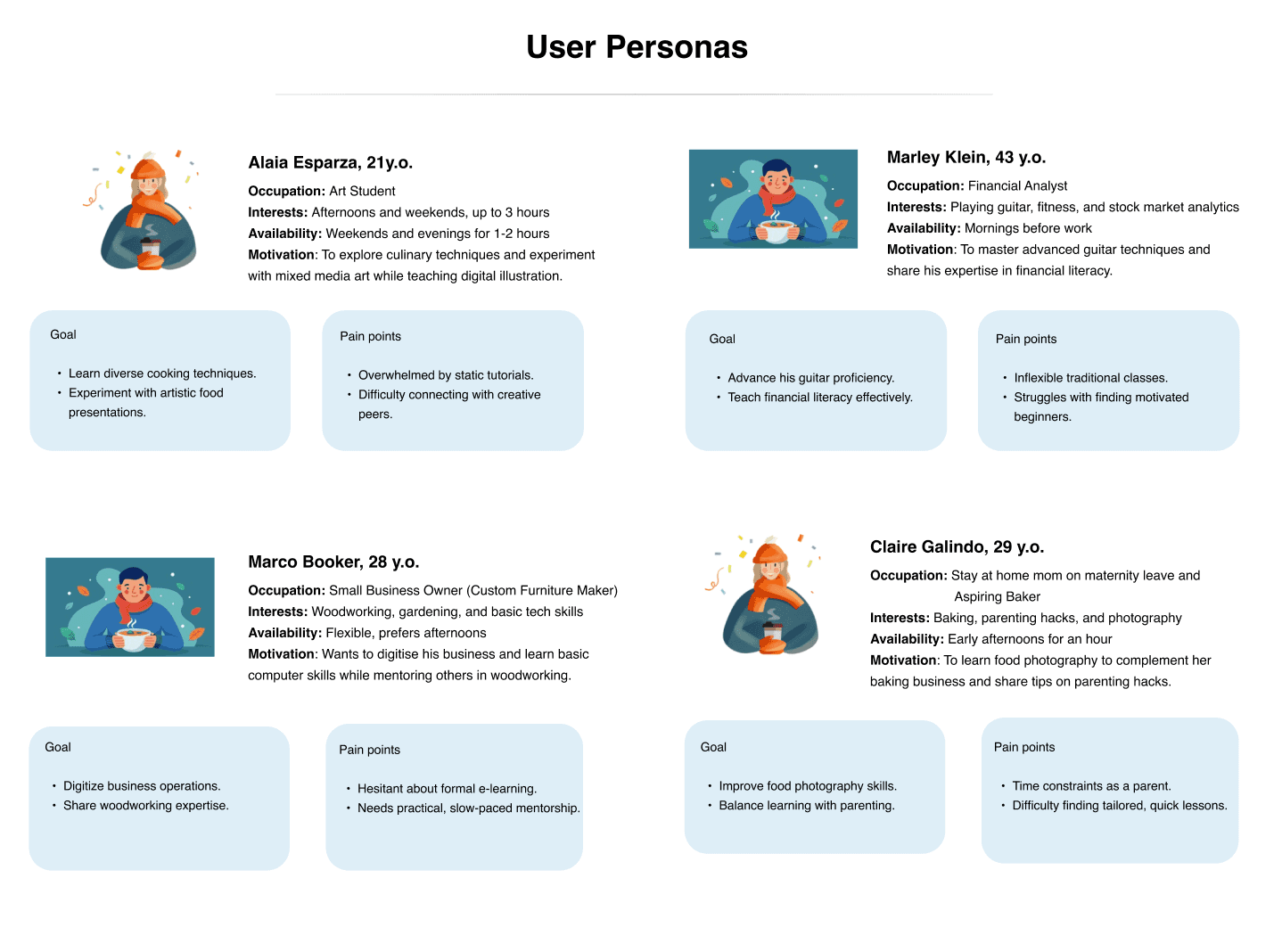
I conducted interviews and a survey to sample viewpoints and synthesized interview notes into behavioral clusters
to understand where learners struggle and what drives their decisions to guide the direction of my product.
The affinity map further helped me draw a few patterns:
Reduce cognitive load during skill discovery
Turn “I don’t know where to start” into “This makes sense for me.”
Increase trust and compatibility in the matching system
Build confidence that their partner is credible, aligned, and worth their time.
Enable a smooth transition from match → booking the first session
Remove friction so progress feels natural, not like another task.
I actually know a few skills well enough to teach, but there’s no clear
place to share them. I want an easy, structured way to both teach
and learn without feeling like I have to be a professional instructor.
#1
I’m motivated for a week and then life gets in the way. If I could match
with someone who has a similar schedule and is equally serious,
I’d finally stick to my learning goals.
#2
I’m trying to transition into a new field, but formal courses feel
expensive and isolating. I wish I could practice with someone who’s
already ahead of me and willing to exchange knowledge without it
feeling transactional.
#3
THE SOLUTION
Trust and credibility gaps
Users want to learn from real people, but they’re unsure who to trust.
Difficulty verifying someone’s actual skill level
Lack of transparency in profiles
No accountability mechanism
SkillSwap is designed to make learning feel personal and teaching feel meaningful, without the overhead of traditional classes, long courses, or confusing platforms.
2. Matching Uncertainty
People don’t know who they’ll get matched with or how well the exchange will work.
Worries about compatibility in learning styles
Fear of skill mismatch
Unclear expectations between partnersNo accountability mechanism
Emotional Friction
Skill exchange isn’t just functional, it’s emotional.
Fear of “not being good enough”
Nervousness meeting strangers
Feeling overwhelmed when learning new skills
Desire for Guidance and structure
Users want to grow, but without chaos.
Clear, guided skill-exchange flow
Small, achievable steps
Visible progress metrics
Designing a simple and manageable experience
Everything in the solution was shaped by one aim
No
User pain points
This led to two guiding questions:
HMW make a skill exchange feel effortless, rewarding, and trustworthy?
HMW reduce the friction of discovering and connecting with the right people, so users can focus on learning, not logistics?
These became the design anchors that shaped every decision moving forward.
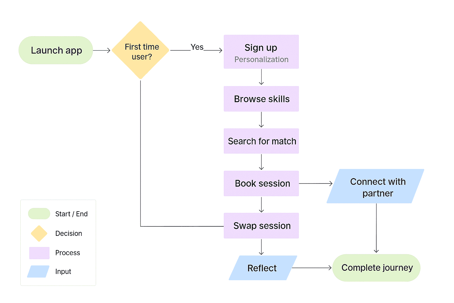
The user journey map for first-time user's. Onboarding them
through a personalization process, having them take their first
lesson and completing their first quest
Organizing notes, quotes and behavioral patterns gathered from my research
through affinity mapping
Interviewed few users to understand the perspectives among
different age groups
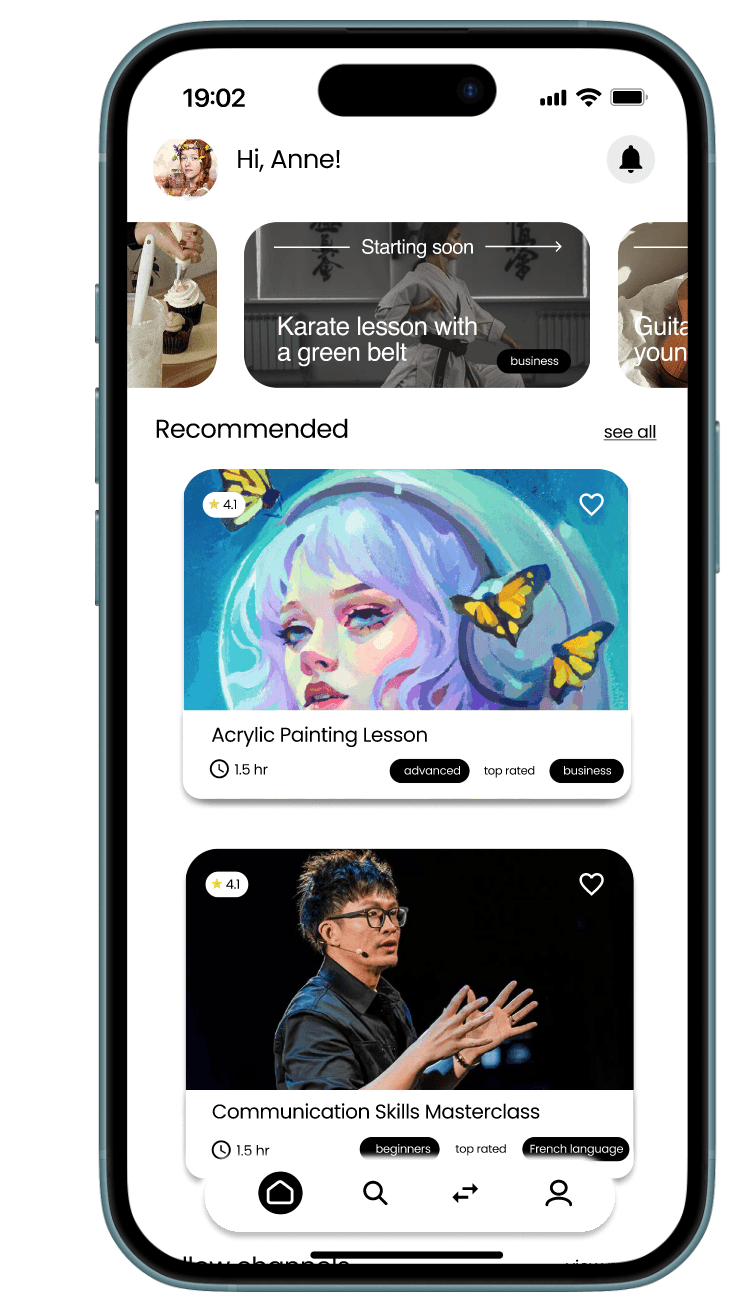
onboarding
discovery/matching, and
the learning flow itself.
Each was reimagined to feel guided, calm, and confidence-building.
reduce friction,
increase clarity, and
make peer learning feel safe and structured.
To do this, I focused on 3 core experiences:
🎯
✅
After mapping the challenges, opportunities, and motivations, one clear theme emerged:
People want to learn and teach, but the effort behind organizing, trusting, and finding the “right” match is what stops them.
Why was it designed it this way
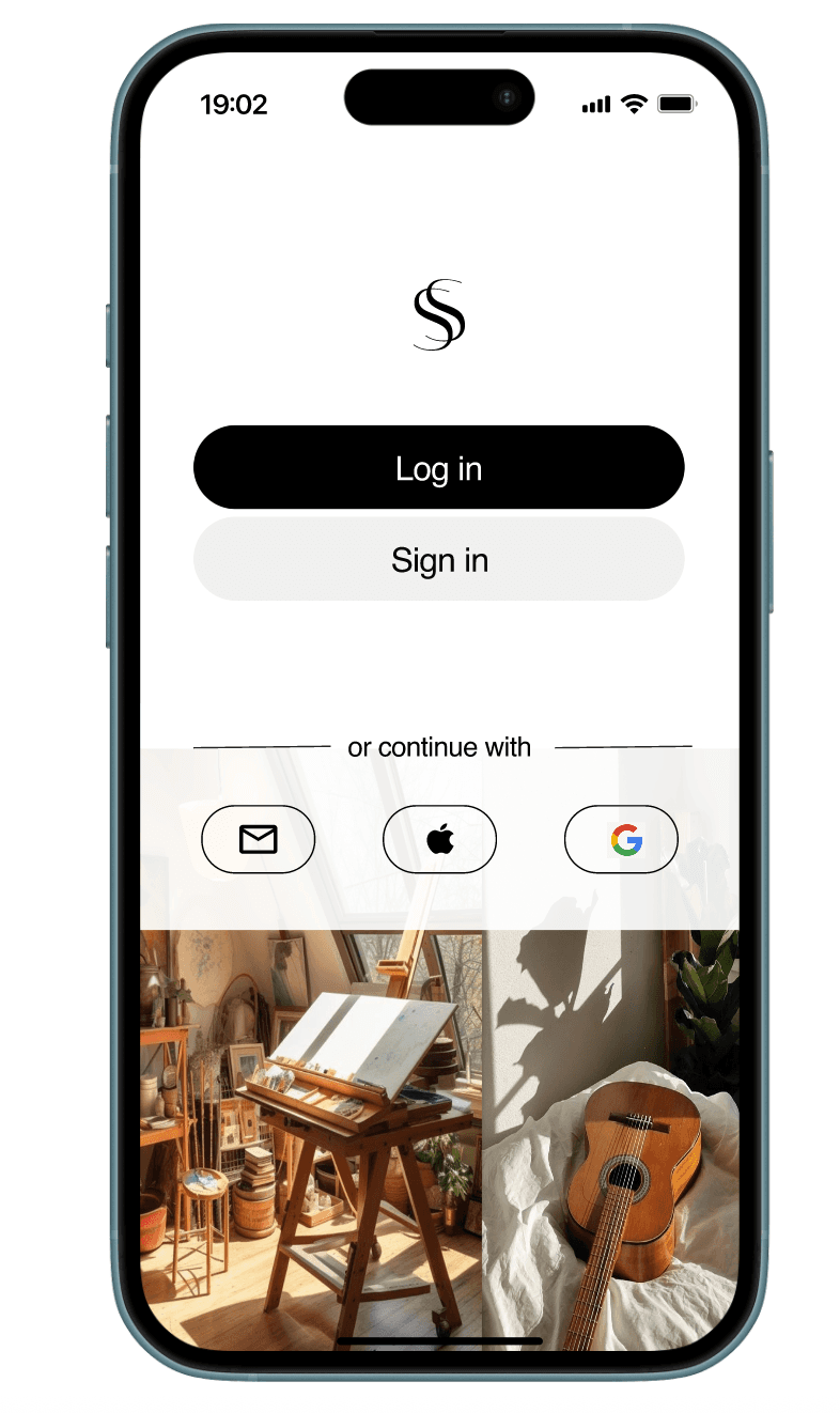
Users told that they want to “quickly know if this app is for me.”
So the onboarding focuses on clarity, warmth, and recognition.
Design decisions
Clean logo reveal to establish brand trust
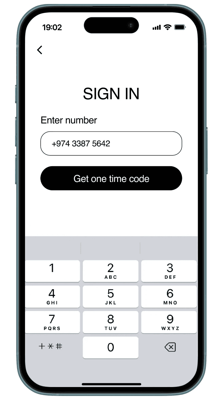
Quick number login to reduce friction
Optional social logins for returning users
Immediate display of categories to set expectations early
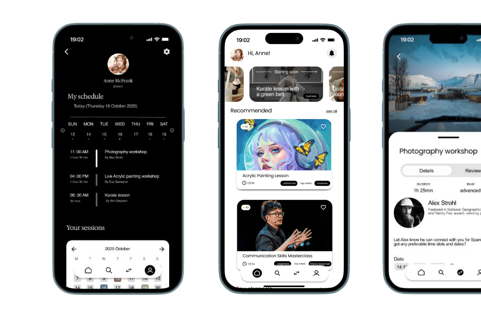
1. A familiar, welcoming start
Design decisions
3. A Marketplace That Inspires Learning
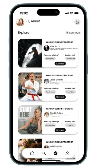
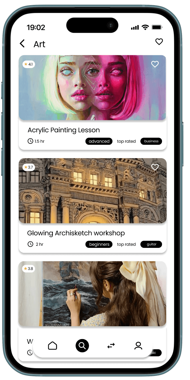
Users wanted to “feel excited, not obligated” when browsing sessions.
So instead of dense information blocks, the Experience Feed highlights emotion, creativity, and people.
Design decisions
Big visuals create immediacy and connection
Skill cards introduce the instructor as a real person
Clear difficulty + tag labels for fast scanning
Minimal text, maximum inspiration
Design decisions
5. The Confirmation Moment
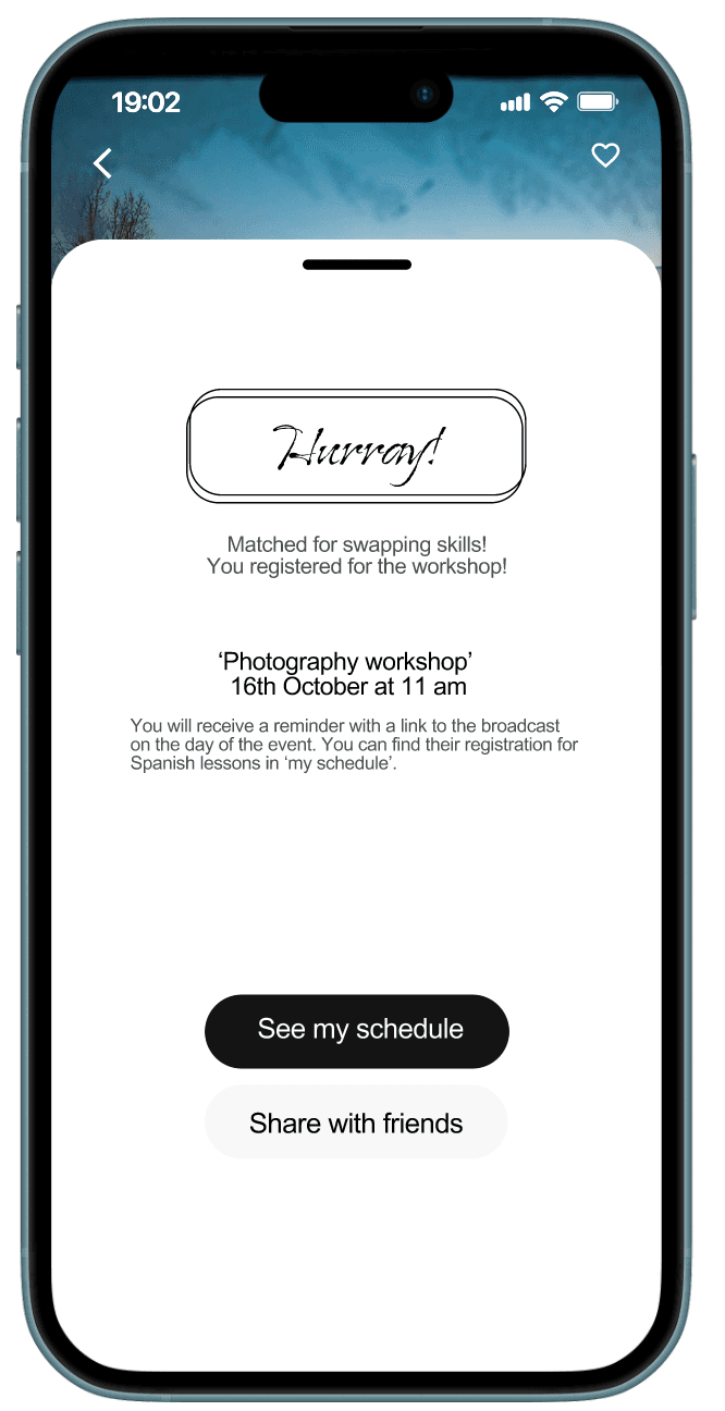
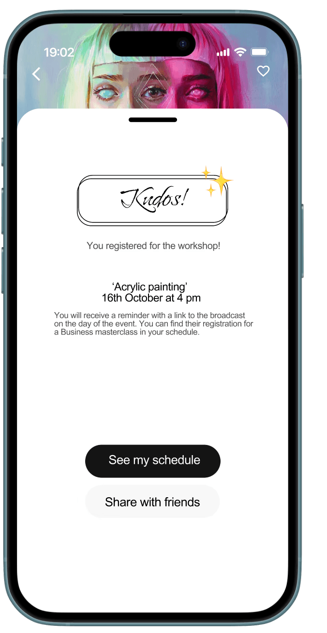
Users said they feel “most connected” at the moment of joining.
So I framed this moment with delight.
Design decisions
Friendly confirmation screen
Soft illustration + celebration micro-cue
Clear upcoming session details
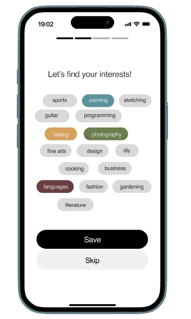
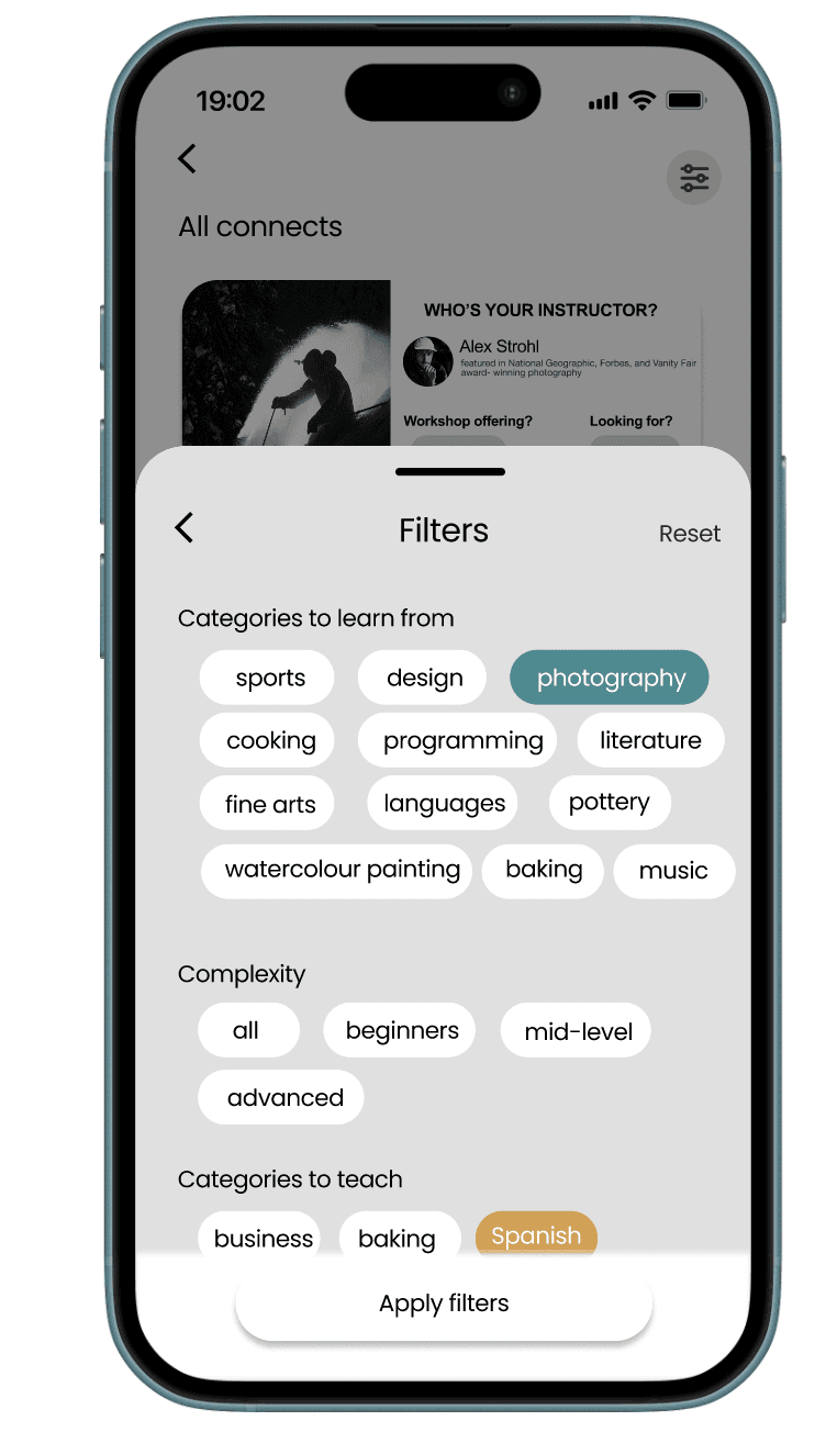
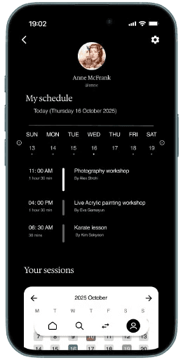
2. Skill Discovery That Feels Natural
This led to…
Users wanting both flexibility and guidance. Too many options overwhelm; too few options feel restrictive.
-> So, I introduced a tag-based discovery system: playful, lightweight, and easy to browse.
Rounded category tags with soft neutrals to reduce cognitive load
A “Save / Skip” dual action for flexibility
Filter sheet with clear hierarchy (learn, teach, complexity)
Pastel accent for selected chips to subtly guide attention
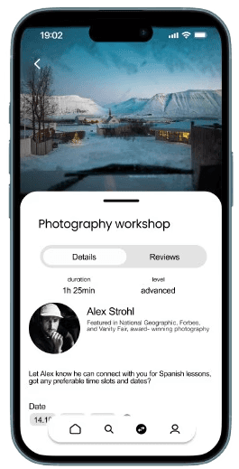
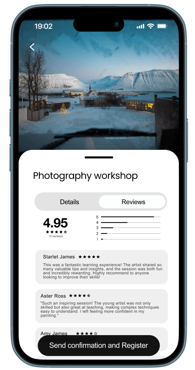
4. Depth When You Need It
Users wanting legitimacy before committing.
They needed to trust both the instructor and the content.
-> The details page was designed to be kept purposeful, not too long, not too shallow.
Two-tab structure (Details / Reviews)
Clean instructor spotlight with credentials
Pastel CTAs that stand out without shouting
Generous spacing for readability
Design decisions
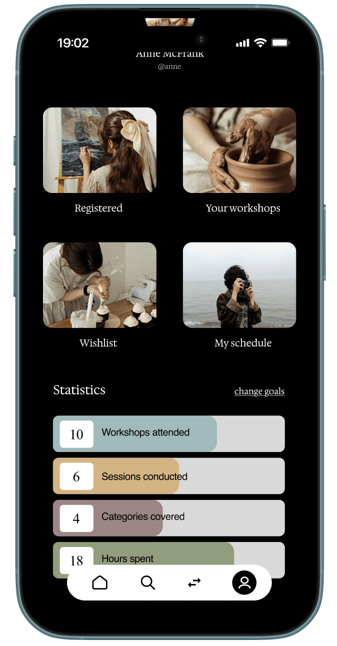
6. Building a Sense of Progress
This came from…
Users wanting to track growth, not in a gamified way, but as a reflection of real learning.
I introduced a simple statistics dashboard:
Sessions attended
Sessions conducted
Categories explored
Success metrics
Information architecture
What I learned
The importance of intention, every component must earn its place
Early iteration saves late-stage rework
Clear communication within the team accelerates alignment and creativity
To support the guided, trust-first approach, we developed a clear, hierarchical structure that ensures users always know where they are and what comes next.
Final takeaways
If I had more time
Conduct broader longitudinal testing
Expand accessibility support
Build more tools for instructors (templates, analytics, communication)
BUSINESS IMPACT
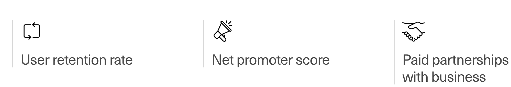
User Engagement
Workshops attended
©
Nitya Gaddala
2025
learner <-> mentor
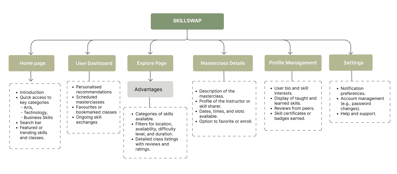
A clear information hierarchy that keeps SkillSwap simple, predictable, and easy to navigate.